Simplifying Defi Products into a Scalable Experience
Notional Finance, Defi's top leveraged yield protocol.
UX researcher, UX/UI design, UX testing, Webflow development
6 months
Redesigned Notional’s product experience around leveraged vaults, consolidating multiple fragmented offerings into a single, streamlined interface. The new structure significantly simplified the user journey, reduced decision friction, and created a scalable foundation for future vault expansion. The solution received strong internal adoption and replaced several legacy product flows.
Context
Notional Finance is a DeFi protocol that enables users to earn yield through lending strategies and structured financial products.
This project marked a major product shift:
- Moving away from multiple product types (fixed lending, variable lending, borrowing, liquidity provision)
- Consolidating the experience into leveraged vaults
Users
- Crypto-native users seeking yield
- Advanced users comfortable with leveraged strategies
- Users comparing risk/reward across opportunities
Business Model
- Protocol generates revenue through vault participation and activity
- Incentives (token rewards, points) drive user engagement
Why this project mattered
The previous product experience created:
- Too many decision points
- Fragmented navigation across multiple pages
- High cognitive load when comparing options
This led to:
- Confusing user journeys
- Drop-offs during product selection
- Difficulty scaling as more vaults were introduced
The Problem
Before this redesign:
- Vaults and products were spread across multiple pages
- Users had to navigate between different product types
- Comparison required mental effort across screens
- Information density made decisions intimidating
Key symptoms:
- High bounce rates
- Sporadic and inconsistent user flows
- Friction when choosing where to deposit
- Confusion around rewards and strategy differences
Core problem:
Users couldn’t easily compare options or confidently choose a vault.
My Role
I was the sole product designer on this project.
Responsibilities included:
- Defining the structure of the vault browsing experience
- Partnering with co-founders to determine key metrics and hierarchy
- Designing desktop and mobile UX
- Leading iteration cycles based on internal testing
- Working directly with engineering on feasibility
- Building ~90% of the final page in Webflow
Constraints
- No-code limitations (Webflow) created technical constraints on layout and interactions
- Small engineering team required efficient, scalable solutions
- Highly complex financial data needed to be simplified without losing meaning
- Product needed to scale to 20+ vaults over time
Strategy & Thinking
Insight
Users don’t struggle with too few options—they struggle with comparing too many complex options.
Hypothesis
If we centralize vaults into a structured, comparable format, users will:
- Make faster decisions
- Better understand differences between vaults
- Be more likely to deposit
Key Design Decisions
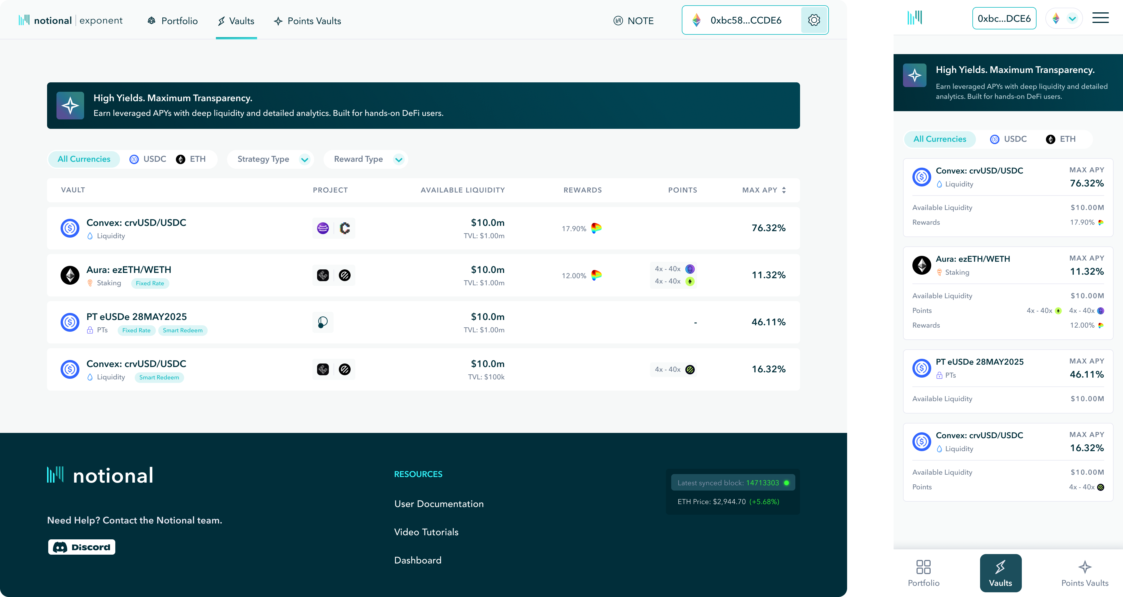
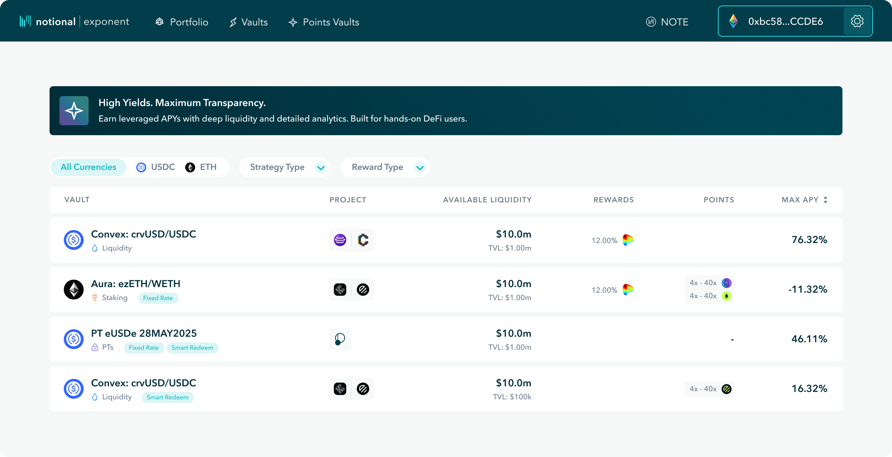
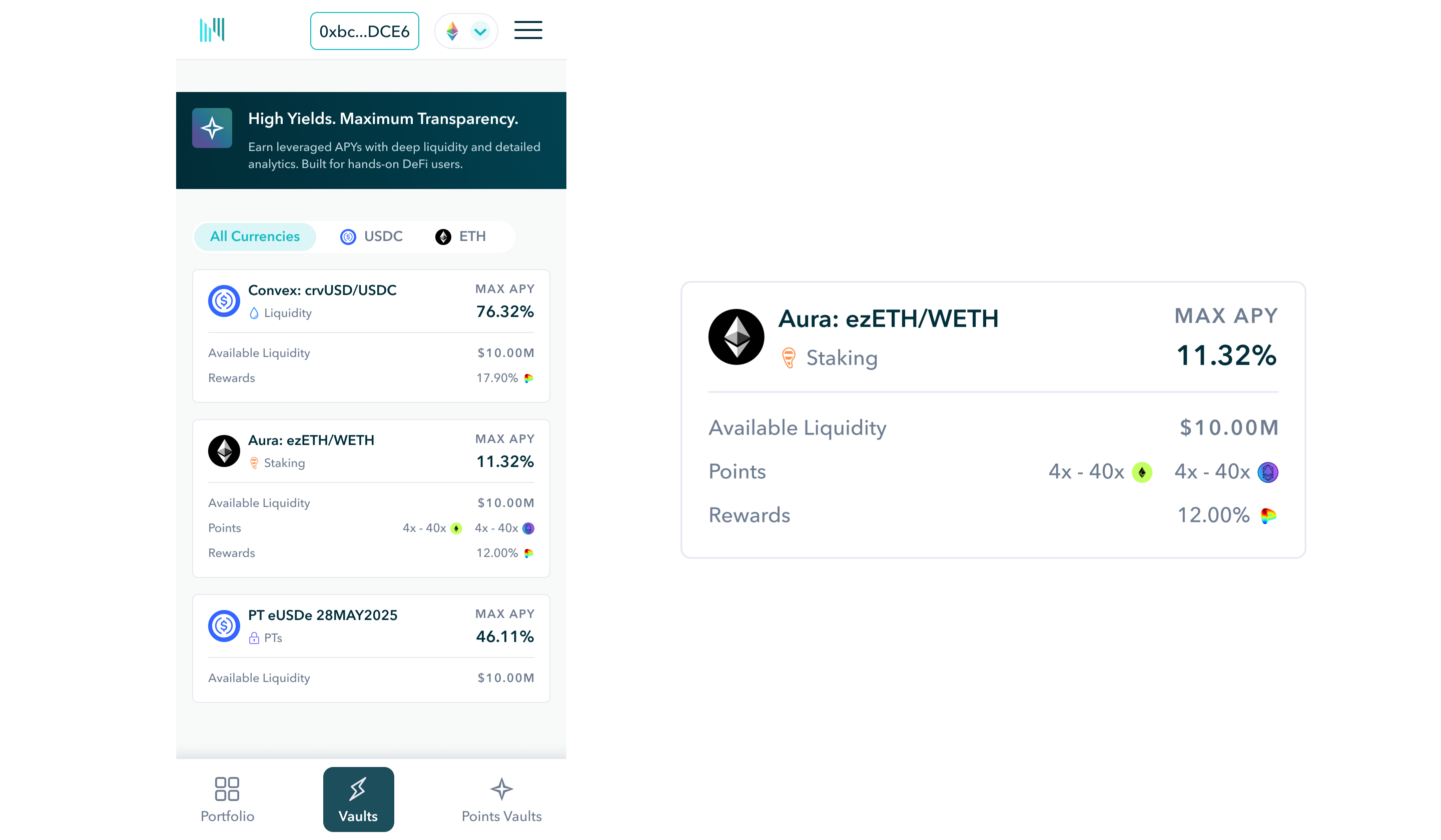
1. Table view for desktop
- Enables efficient comparison across multiple vaults
- Aligns with industry patterns for financial products
- Scales cleanly as more vaults are added
2. Carefully selected columns (not everything)
Included:
- Vault name + type
- Deposit token
- TVL / liquidity
- Rewards (APY, incentives, points)
- Max APY
- Focused on decision-driving metrics, not exhaustive data
3. Filters above the table
- Allows users to quickly narrow options by:
- Deposit token
- Strategy type
- Reward type
- Reduces overwhelm and supports intent-driven browsing
4. Project tooltip (not full section)
- Kept contextual information accessible but not dominant
- Prioritized decision-making over deep exploration
5. Banner for orientation
- Provided lightweight explanation without slowing users down
Desktop → Mobile Transformation (Key Focus)
The Problem
Tables work well on desktop, but on mobile:
- Horizontal scrolling breaks usability
- Dense data becomes unreadable
- Comparison becomes overwhelming
The Solution: Card-Based Mobile Design
Converted each vault into a scannable card format.
Each card includes:
- Vault name and type
- Deposit token
- Rewards and APY
Removed:
- TVL
- Project tooltip
- Some filtering options
Why This Works
- Prioritizes legibility over completeness
- Supports quick scanning and tap interactions
- Reduces cognitive load on smaller screens
Key Principle
Desktop = comparison
Mobile = clarity and quick decisions
Process
Step 1: Wireframing
Started with low-fidelity layouts to:
- Define table structure
- Prioritize columns
- Establish hierarchy
Step 2: Iteration & Testing
- Collaborated with co-founders to refine metrics
- Ran internal testing on:
- Vault selection flow
- Navigation from landing → vault → transaction
- Iterated multiple times to reduce friction
Step 3: Build & Implementation
- Designed final UI in high fidelity
- Built ~90% of the experience directly in Webflow
- Solved multiple no-code limitations through custom workarounds
Step 4: Mobile Design
- Designed mobile after desktop (75% desktop users)
- Reworked layout entirely into card system

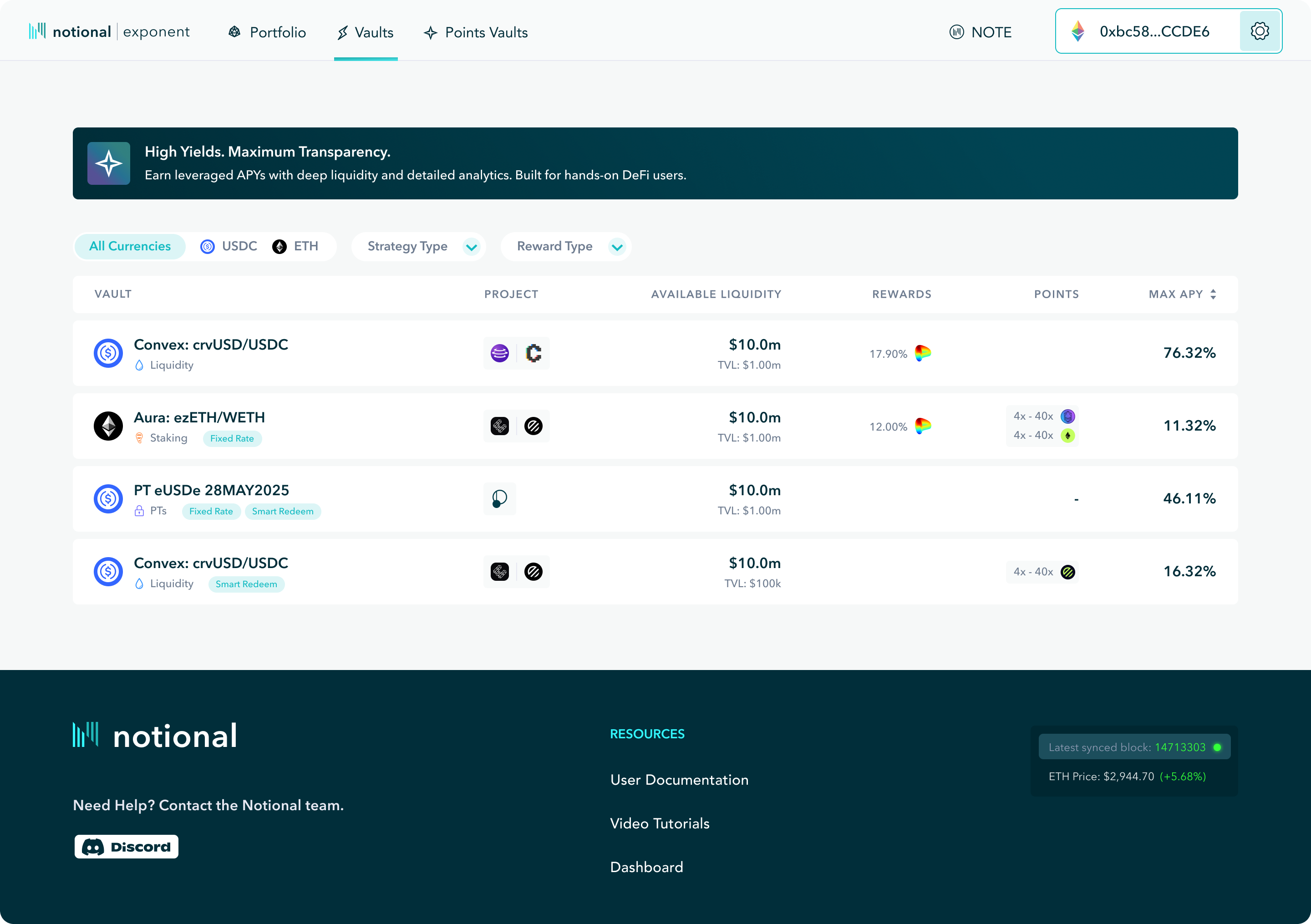
Final Solution
The final experience includes:
1. Intro Banner
- Brief explanation of vaults
- Sets context without slowing users
2. Filter System
- Deposit token
- Strategy type
- Reward type
- Enables quick narrowing of options
3. Vault Table (Desktop)
- Clear, structured comparison across all vaults
- Focus on decision-critical metrics
- Scalable for future growth
4. Mobile Card System
- Simplified representation of each vault
- Optimized for readability and interaction
Design Principles Applied
- Comparison-first design
- Clarity over completeness
- Scalability for growth
- Contextual complexity (progressive disclosure)
Results
- Simplified overall product experience by consolidating multiple offerings
- Reduced friction in the vault selection process
- Strong internal feedback from product and leadership
- Established a scalable system for future vault expansion
While external metrics were not captured due to timing, the redesign:
- Improved product clarity
- Reduced decision complexity
- Created a more cohesive user journey
Reflection
What I’d improve
- Add analytics to measure:
- Conversion to deposits
- Filter usage
- Vault comparison behavior
- Test different mobile layouts for deeper comparison
- Explore hybrid table/card solutions for tablet devices
What I learned
- In complex financial products, comparison is the product
- Desktop and mobile require fundamentally different approaches
- Constraints (like Webflow) force better prioritization and clarity
Next project

Do you have an idea? Let’s talk about it.
Schedule a pressure free strategy call at your conveinence to explore ways we can grow your business.