Onboarding Flow for Newcomer Conversion
Notional Finance, Defi's top leveraged yield protocol.
UX researcher, UX/UI design, UX testing
2 months
Redesigned Notional’s onboarding flow to reduce drop-off and guide users from first touch to transaction. Simplified a fragmented product experience into two clear paths—helping users act faster and with more confidence.
Context
Notional was a DeFi protocol offering multiple financial products, including lending, borrowing, liquidity provision, and leveraged vaults. While this breadth supported a wide range of users, it created a fragmented and inconsistent user journey.
Users primarily entered through Twitter, Discord, and organic channels, with a core audience of crypto-native “power users” seeking high-yield opportunities and comfortable with higher risk.
At the time of this project, the company was rebranding to Notional Exponent, shifting strategy to focus exclusively on leveraged vaults. This created an opportunity to rethink the onboarding experience and align the product with a more targeted user base.
The Problem
Users were consistently dropping off before completing their first transaction.
Key issues:
- Too many product options created decision paralysis
- No clear primary path through the product
- Transaction pages were overloaded with information
- User journeys were inconsistent and unpredictable
Analytics showed:
- Highly fragmented navigation paths
- No dominant conversion funnel
- Significant drop-off at transaction pages
The result: users explored, got overwhelmed, and left without taking action.
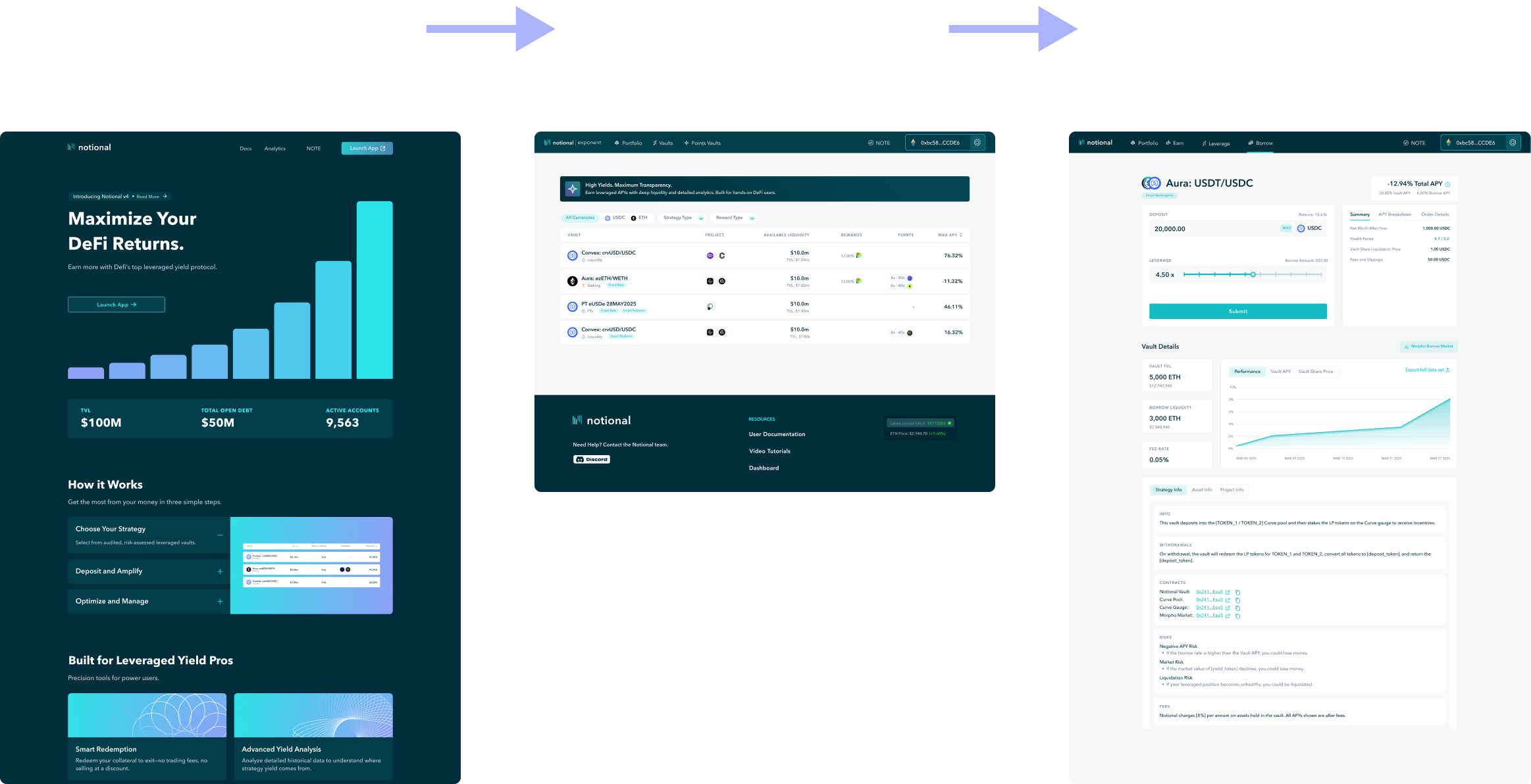
Before State
The previous experience lacked focus and direction.
- Landing page presented multiple competing CTAs
- Three primary product categories (Earn, Leverage, Borrow), each with sub-products
- Portfolio page doubled as both onboarding and management
- Filters, toggles, and product variations added complexity
- Multiple entry points into different transaction flows
Users had to:
- Choose a product category
- Choose a product type
- Choose a network and asset
- Then navigate to a transaction page
There was no guided path, just a series of decisions.
My Role
- Sole product designer leading UX strategy and execution
- Analyzed user behavior and site analytics to identify drop-off points
- Defined the new onboarding structure and user flows
- Collaborated with two co-founders (product) and an engineer
- Led weekly design reviews from wireframes to final designs
- Designed the full Notional Exponent rebrand (UI direction, branding, visual system)
- Built key pages (landing + vault page) in Webflow
Constraints
- Small team with limited engineering bandwidth
- Tight timeline aligned with rebrand launch
- Webflow limitations for implementation
- Needed to simplify without losing critical financial detail
Strategy & Thinking
Core Hypothesis
Users were dropping off because the product required too many decisions too early, without enough guidance.
Key Strategic Decisions
1. Eliminate Choice Overload
Removed multiple product lines (lending, borrowing, liquidity) and focused entirely on leveraged vaults.
2. Split User Paths by Intent
- New users → guided toward first transaction
- Returning users → directed to portfolio management
3. Enforce a Primary Path
Designed the experience around a single dominant CTA to reduce wandering and indecision.
4. Prioritize Action Over Exploration
Moved critical inputs (deposit + leverage) above the fold and pushed deeper analytics to secondary sections.
Trade-offs
- Reduced product flexibility in favor of clarity
- Removed some educational and exploratory content from primary flows
- Accepted less customization upfront to improve conversion
The Flow
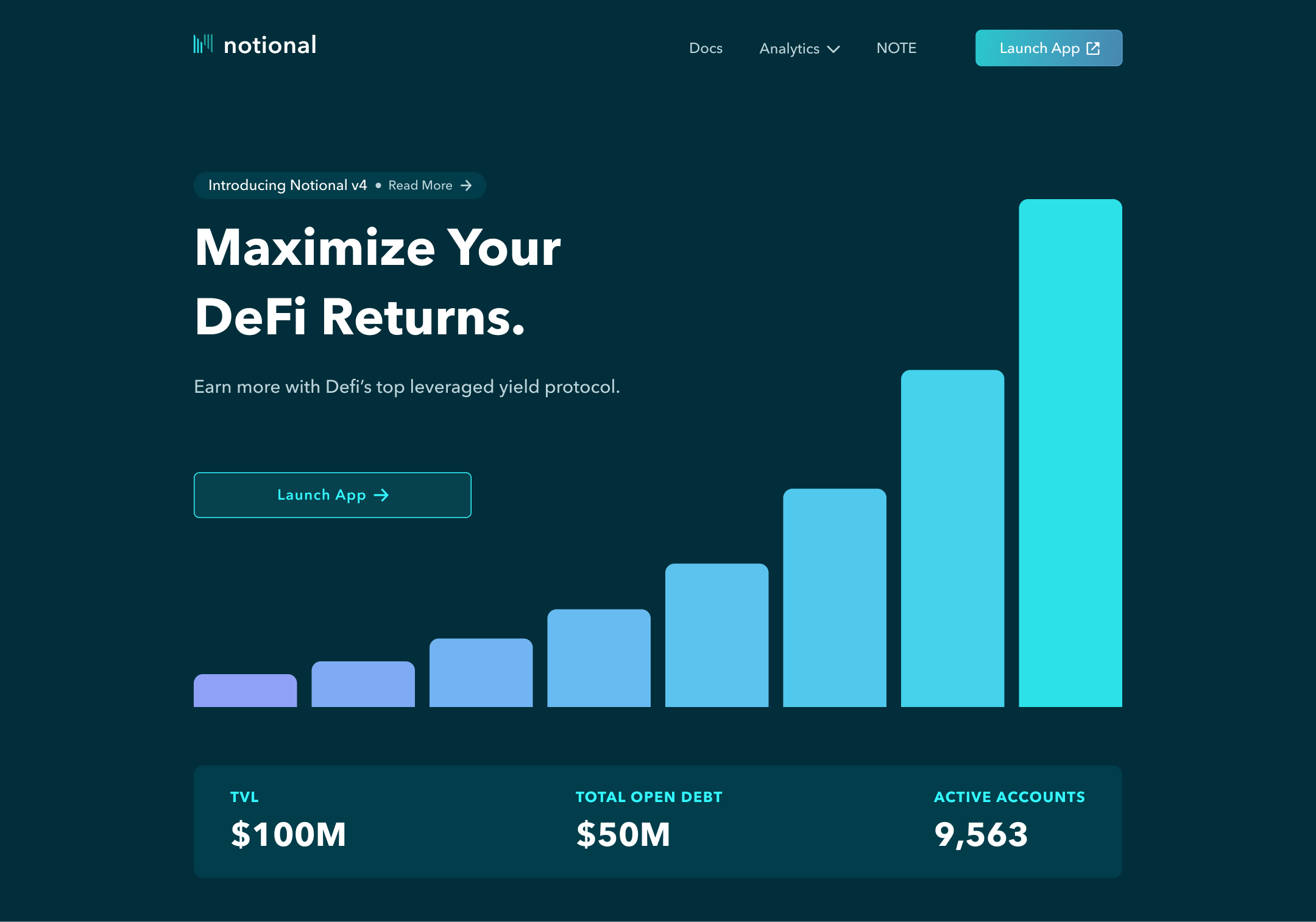
Step 1: Landing Page (Entry Point)
- Simplified layout with a single primary CTA
- Secondary links deprioritized to avoid distraction
- Clear direction: enter the app
Step 2: Smart Routing (New vs Returning Users)
- Wallet connection used to determine user state
- New users → Vaults page
- Returning users → Portfolio page
This created two clear, intent-based experiences.
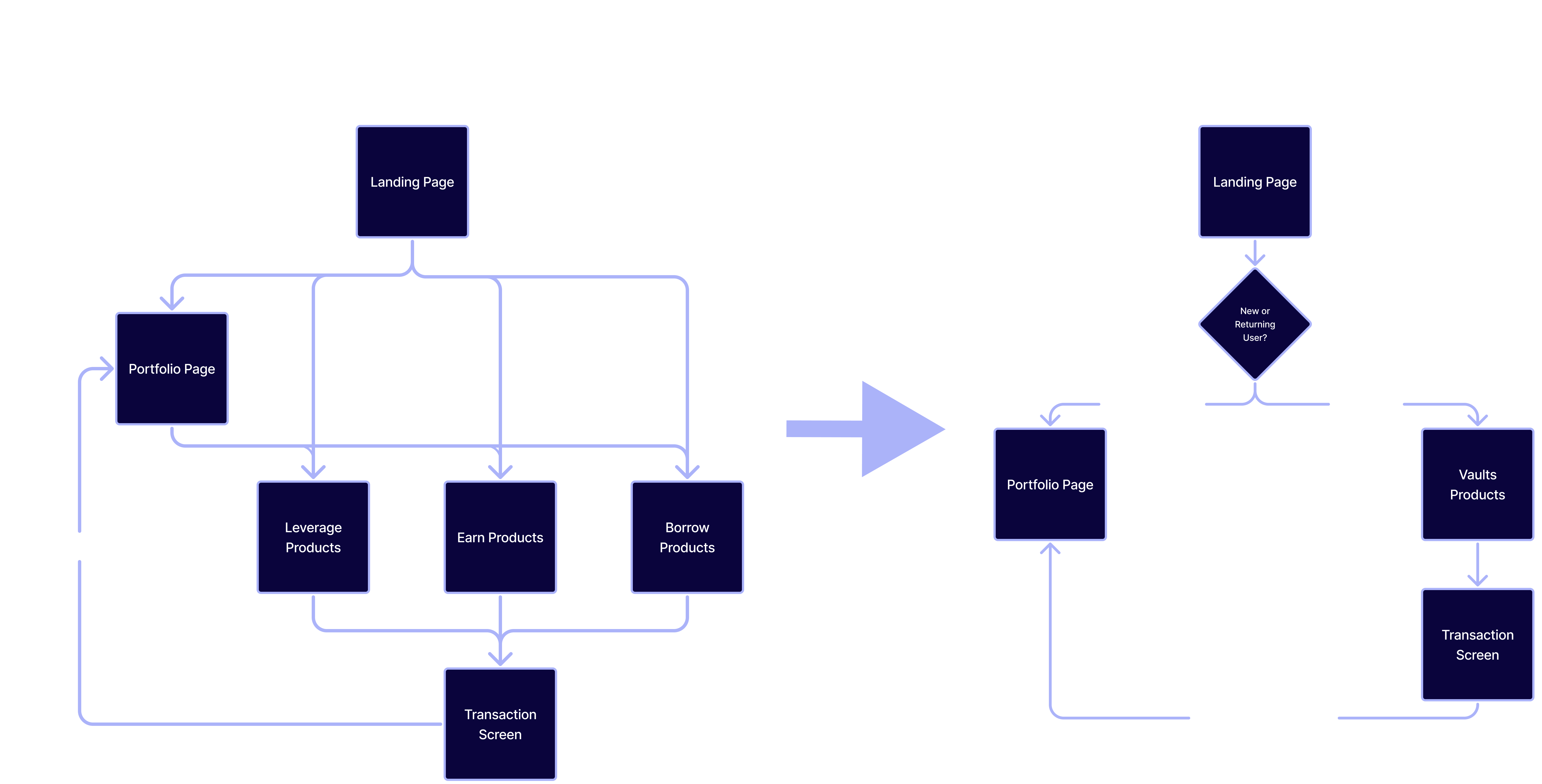
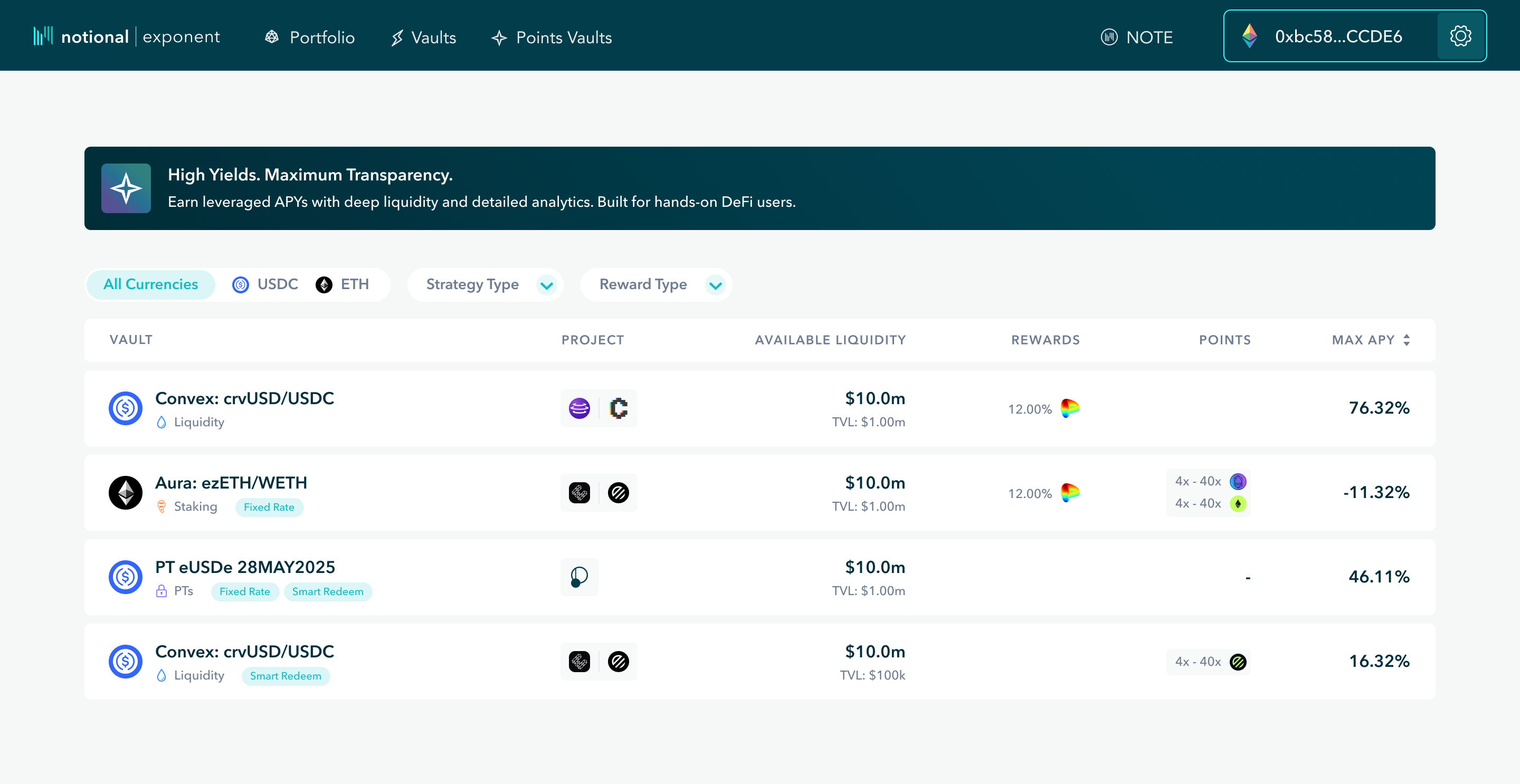
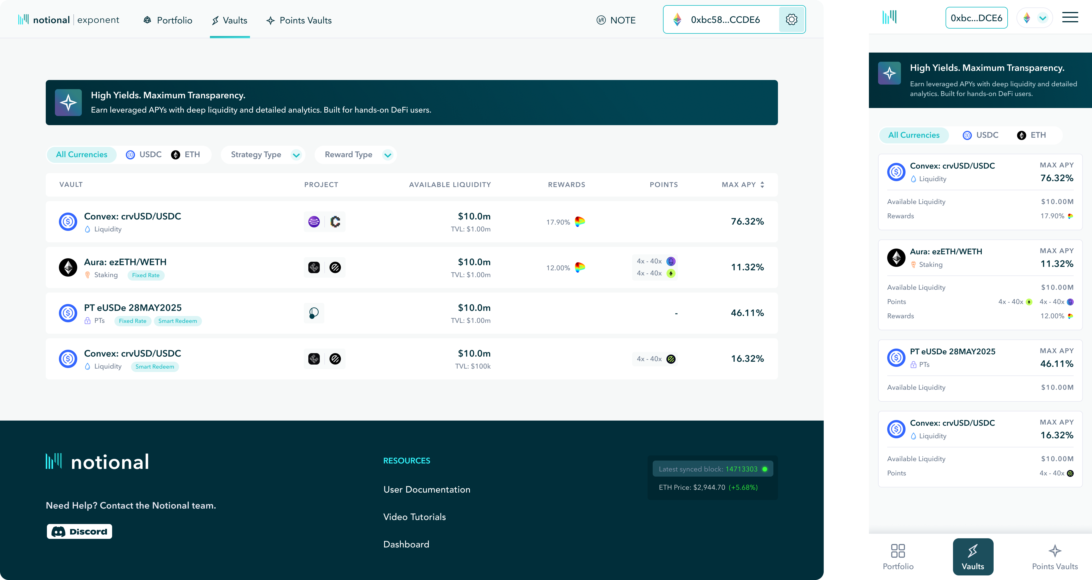
Step 3: Vaults Page (New User Path)
- Replaced multiple product pages with a single vault table
- Standardized structure for scanning and comparison
- Filters simplified decision-making
Users now:
- Land → scan → select → act
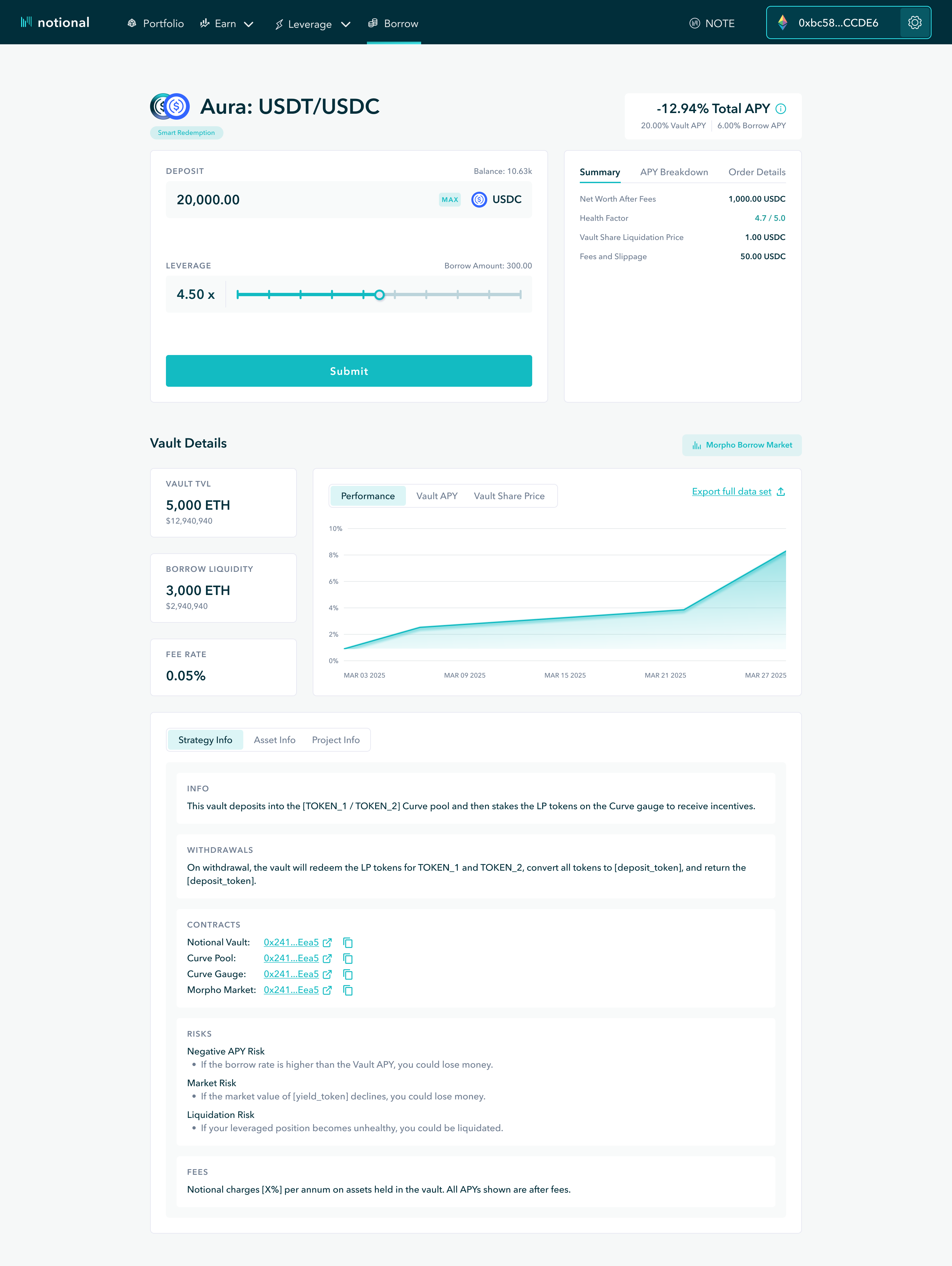
Step 4: Transaction Page (Conversion Point)
Redesigned to prioritize action:
Above the fold:
- Vault name + total APY (with breakdown)
- Deposit input + leverage selector
- Real-time position preview
Below the fold:
- Vault details (TVL, fees, liquidity)
- Performance charts
- Strategy and asset breakdowns
Shifted from:
Information-heavy → Action-first
Step 5: Portfolio Page (Returning Users)
- Clear overview of positions
- Easy access to performance, risk, and management
- Encouraged repeat transactions
Process
- Started with wireframes to define structure and hierarchy
- Iterated through MVP designs with internal team feedback
- Conducted informal usability testing with team members
- Refined through multiple iterations before final delivery
- Designed responsive behavior (desktop-first, then mobile)

Final Solution
A simplified onboarding system with two clear paths:
- New users: Guided from entry → vault selection → transaction
- Returning users: Immediate access to portfolio + management
Key improvements:
- Removed unnecessary decision points
- Created a predictable, repeatable user journey
- Prioritized inputs and actions over passive information
- Aligned product structure with target user (power users)
Results
While formal metrics were limited due to timing of the rebrand:
- Clear, consistent user journeys replaced fragmented paths
- Reduced cognitive load across the experience
- Faster navigation from entry to transaction
- Improved internal alignment on product direction
- Simplified product offering strengthened marketing clarity
Reflection
What I’d improve:
- Conduct deeper user testing on the transaction flow
- Validate conversion improvements with stronger analytics tracking
- Move beyond Webflow to enable more flexible interactions
What I learned:
- Reducing options often creates more value than adding features
- Clear user paths outperform flexible but ambiguous systems
- Product strategy and UX are tightly connected—structure drives behavior
Next project
Do you have an idea? Let’s talk about it.
Schedule a pressure free strategy call at your conveinence to explore ways we can grow your business.